
QUESTIONS TO ILLUSTRATE HUMANITY

Our vast planet harbours life of all sorts. Humans make up for a lot of what happens on its surface.
The data used in this research spans all five inhabited continents, 206 countries and approximately 7.58 billion human beings in 2017. It covers various domains of society, from a breakdown of employment rates by economic category down to the number of people making use of mobile phones and the internet per 100 inhabitants.
Via five big questions, our Data Visualization team has covered the statistics that define the world in its social, economic, geographical and environmental aspects. Stay tuned as we navigate through data visualizations and unearth compelling narratives that shape our global reality.
Table of Contents


Question One
What countries in the world have the highest level of GDP growth ?

As via this scale, measured in % of GDP growth, data from 2017
GDP growth (in %) by country excluding erroneous values
Economic growth has always been heterogeneous. Famous business booms of the past include the Industrial Revolution of the past which allowed great leaps in productivity and thus GDP growth. At the top of the list of countries with biggest GDP growth stands Ireland, second to which is Nauru. Following that, nowadays, via the trickle down effects of such productivity gains, a plethora of countries in Asia and Africa are reaping numerous benefits.
As via this scale, measured in % of GDP growth, data from 2017
In Asia, India, Laos, China, Myanmar, Cambodia, Uzbekistan, Vietnam are figuring among the countries with the biggest GDP growths. In Africa, Ethiopia, Mali, Rwanda, Senegal, Tanzania, Kenya, Benin, among others, all figure among the top 30 countries with the biggest growing GDP. Of interest are also small nations, island-states like Monaco, Nauru, the Seychelles, Palau, Papua New-Guinea which all experience high GDP growth (above 5%) per year
Question Two
What countries in the world have the biggest trade balance deficits ?
Balance of trade by country
Balance of trade by country (million US$)
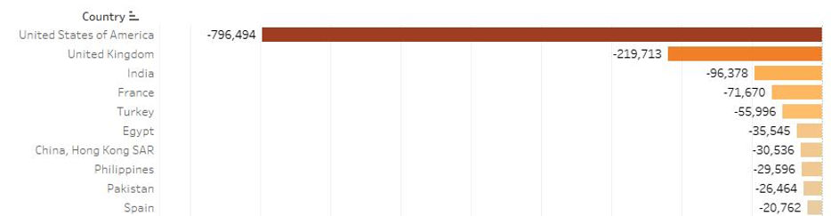
A balance of payments deficit provides valuable insights into a country's economic interactions with the rest of the world. It is a measurement that reflects the financial inflows and outflows associated with international trade, investment, and financial transactions over a specified period.
When a country experiences a balance of payments deficit, it means that its total payments to foreign entities, including imports, foreign investments, and debt repayments, exceed its total receipts from foreign sources, such as exports, foreign investments, and loans. In other words, it indicates that more money is flowing out of the country than coming in.
As via the below bar chart, we see that the United States experiences the biggest balance of trade deficit for the year 2017, followed by the United Kingdom.
Balance of trade by country (million US$)
Question Three
What is the ratio of migrants to locals in a country and its relationship with GDP per capita?

Percentage of Migrants in each country
Color scale: Share of migrants in percentage
Migrants moving to a different country can bring a new set of skills and new perspectives, which can increase economic growth and bring advancements to technological innovation. Whilst also increasing diversity may reduce social cohesion, creating communication barriers, and coordination with others, and may negatively affect economic development.
GDP per capita in relation to migrant population
Amongst the 206 countries, we find that bigger amounts of migrants in a society tend to be linked to higher GDP per capita figures.
Countries like Monaco and Liechtenstein which have a small population, have a high percentage of migrants and a higher GDP per capita. Countries and places like the United Arab Emirates, Qatar, Singapore, and Macao have some of the highest numbers of migrants as a proportion of their society.

Color scale: GDP per capita
Question Four
What is the relationship between labour force
participation and life expectancy ?
Certain occupations can be more hazardous than others. High labour force participation rates and low life expectancies can indicate to us that a major portion of a working force is employed in hazardous work. What do the numbers tell us ?
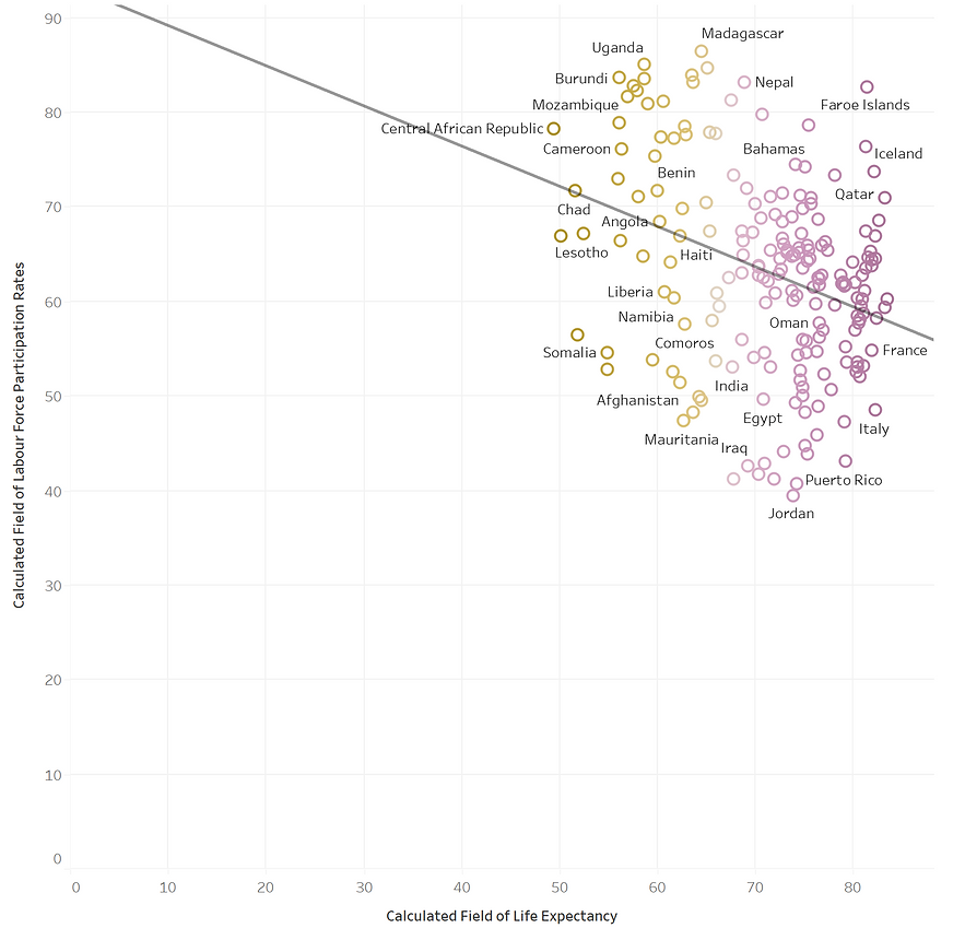

Average life expectancy in years in relation to labour force participation
Color scale: Average life expectancy in years
The graph on the top represents the relationship between labour force participation rates and average life expectancies. It aggregates and averages genders on each axis. As shown via the trend line, higher life expectancies are linked with lower labour force participation rates. In short, the lower the percentage of people in a population work, the longer that population tends to live.
Question Five
What do pollution estimates tell us about GDP per capita ?
Modifications of the environment are required to transform raw elements in manufactured goods. This move has a cost, almost always in the form of environmental degradation and pollution. Some activities such as permaculture limit CO2 emissions, while other activites such as aluminium smelting can often significantly affect surrounding air, water and ground pollution metrics.

Levels of CO2 Emission (100 Kilotons) relative to GDP per capita
Color scale: Fertility rate (live births/woman)
The graph above illustrates the relationship between emission estimates for all the countries included in the dataset and their associated GDP per capita. A trend line (in green) shows us the tendency for GDP per capita to increase as estimated levels of pollution increase. Also added is a scale highlighting fertility rates. We see that both highly polluting and/or countries with high GDP per capita also show a tendency for lower birth rates.